
18 Feb, 2019
It is evident that a strong logo can have immense impact on your business by catching the attention of a wide number of people. Logo helps in generating faith among all the existing customers as well as the new customers towards your genuine service and thereby making them attached or fixed to your service for years to come. There can be many reasons for you to plan for a logo redesign. Sometimes, brands fail at the first time to make an impact through its logo and they opt for certain changes to make it more attractive. Sometimes, the first logo becomes outdated after a few years and the brands choose to completely redesign it according to the present vibe. Be it any reason, logo redesign is not a difficult task anymore as you can easily get in touch with a logo design company nearest to you and avail the best service catering to your needs and budget. This blog discovers some unknown facts about the logo modification history of world’s best companies. Read on to know how all the globally acclaimed brands modified their logo over time and made the brand new logos super attractive yet again.
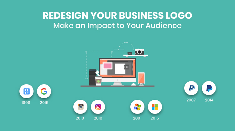
Google: Over the past two decades, the logo has been changed several times to make it more appropriate as per the changing trends of the world. Google’s first logo was simple and compact portraying bold fonts in multi-colour. The colour order changed with time while keeping the same colours in mind. Incorporating a 3D effect and Baskerville Bold style, the logo appeared to be more attractive and visually appealing to the global users. The multi-coloured logo became the unanimous voice of this diverse universe. The present icon of Google with a capital G is advanced and yet similar to the original one.
Amazon: Started up as an online bookstore, Amazon today is world’s topmost e-commerce store that has billions of followers from across the globe. The first logo of Amazon was a capital A with blue colour theme and water texture, pleasing to the eyes. The cool shade and water texture made the logo appropriate for the service they provided and later on as they expanded, modified it by incorporating black font and the tagline ‘books, music and more’. The third logo eliminated the tagline and added an arrow sign at the bottom of the text. The fourth and the latest one included a new tagline ‘and you’re done’ at the bottom right corner of the text. With time, Amazon made three modifications of its logo without changing much and keeping similarity closely to its first modification.
FedEx: As one of the world’s best delivery company today, FedEx has seen leaps and bounds since its inception in 1971. The logo of FedEx perfectly captures this journey with the bold font and bi-colour design. The first logo went by the full name of the company Federal Express. As blue and white backdrops divided with an angular line, the diagonally placed font expressed its growth perfectly. The modified logo is what they have presently and it is quite different from the previous one. The colour theme from blue, maroon and white is replaced by purple and orange and the full name of the company is replaced with the modern abbreviation ‘FedEx’. The twist lies in between the alphabets E and X, where one can easily find out an arrow sign, which symbolizes their promptness and accuracy.
Nike: If minimalism is what you are seeking for, you must follow the evolution of the Nike logo. As the name represents, the brand made it clear about its orientation and the first logo represents the same idea with the name and a swoosh symbol. In 1971, Carolyn Davidson designed the first logo of Nike that was in blue and white colour theme. The swoosh symbol had a great impact among the customers by portraying the spirit of sports. The first modification changed the small fonts with the capital fonts while keeping the over-all design almost similar. The second modification incorporated red as the prime colour to highlight the brand’s evolution. The third modification is what we see presently and it makes a smooth drive towards minimalism with the swoosh sign only.
Microsoft: Just like Google, Microsoft went through several modifications in its journey since 1975. The first logo of Microsoft, designed by Bill Gates and the co-founder Paul Allen, was generated through programming language. The disco aesthetic in curved black font made a huge impact with its appearance. The first modification sharpened the fonts and made it more attractive. The second modification was initiated with inspiration from the company employees to shape the ‘O’ alphabet in an interesting ‘bibblet’ design. The third modification incorporated Halvetica italic font style in black. The latest modification brings back colour and life to the design with a four box icon. The four colours of the boxes symbolize the four successful applications.
With the growth of any company, strategies develop and the logo can truly reflect this development of strategies by taking inspiration from the success. If you feel inspired by reading this blog about logo modification or already have a plan to redesign your company logo, feel free to contact us. We are among the best logo designing companies offering a spectrum of marketing and advertising services, including logo design, to a vast clientele both domestically and abroad. As a brand development company, we can make your struggle easier than ever before!
YOU MAY ALSO READ
HOW LOGO IS IMPORTANT FOR YOUR BUSINESS
HOW CREATIVE LOGO ATTRACT VISITOR TOWARDS ANY BRAND