
02 Oct, 2024
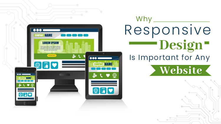
Your website is the face of your brand in this digital age. As more people use a variety of devices like smartphones, tablets, laptops, and desktops to surf the web, it’s essential that your site adapts smoothly across all platforms. This is the magic of responsive design. In 2024, a website that seamlessly adjusts to different screen sizes isn’t a luxury—it’s essential for your success.
In this blog, we’ll explore why responsive web design is vital for your website in 2024, backed by specific insights, technical explanations, and real-world examples. We’ll also highlight how partnering with us, the most trusted website design company in Kolkata, can help ensure your site meets modern web standards.
The Rise of a Mobile-First World
With the increasing reliance on mobile devices for everyday activities such as browsing, shopping, and information gathering, having a mobile-friendly website has become a necessity. In fact, Google reports that over 60% of searches are now conducted on mobile devices. Websites that aren’t optimized for mobile users will likely miss out on significant traffic and lose potential customers.
Whether you choose a custom website design or a template website design, incorporating responsive web design is crucial. Custom designs offer the flexibility to tailor every aspect of your site for different devices, while template designs provide a quick and budget-friendly way to ensure your site looks great on any screen. By integrating responsive design, you can enhance user experience and ensure your website performs optimally across all devices.
Responsive website design ensures that your website automatically adjusts to fit any screen size, whether visitors are browsing from a smartphone, tablet, or desktop. This adaptability offers users a seamless experience, helping to reduce bounce rates and increase engagement.
Key Benefits of Responsive Design for Mobile Users:
1) Effortless navigation across devices
2) Faster load times, especially on mobile
3) Enhanced user engagement, leading to lower bounce rates
By collaborating with us, a reputable web design company in Kolkata, you can design a site that’s optimized for mobile-first usage, ensuring that your website caters to the growing mobile audience.
Improved SEO Performance
Search engine optimization (SEO) plays a critical role in driving organic traffic to your website. Google’s algorithm now prioritizes mobile-first indexing, meaning that websites optimized for mobile devices rank higher in search results. Without a mobile-friendly, responsive website, your SEO efforts could be undermined.
Investing in responsive web design ensures that your website not only looks great but also performs well on search engines. A responsive site offers faster load times, minimizes duplicate content, and provides a better overall user experience, all of which contribute to improved rankings on search engines like Google.
SEO Advantages of Responsive Design:
1) Mobile-first indexing ensures better visibility
2) Faster load times improve SEO performance
3) Unified URL structure helps avoid duplicate content issues
A reputable website design company can work with you to optimize your site for SEO using responsive website design principles, making it easier for potential customers to find your site organically.
Enhanced User Experience (UX)
The user experience (UX) is one of the most critical factors that determine whether visitors stay on your site or leave. If your website is slow, difficult to navigate, or doesn’t display properly on mobile devices, users will quickly abandon it. Responsive design addresses these issues by providing a consistent experience across all devices.
A well-designed responsive website ensures that users can easily navigate, interact with your content, and complete actions, whether they’re filling out a form, shopping, or reading a blog. This kind of fluid, intuitive experience leads to longer browsing sessions, more page views, and higher conversion rates.
UX Benefits of Responsive Design:
1) Consistent look and feel across all platforms
2) Simplified navigation for diverse audiences
3) Enhanced accessibility, improving the overall user journey
Working with an expert web development company ensures that your website is tailored to provide the best possible user experience, keeping your audience engaged and satisfied.
Cost-Effectiveness and Time Efficiency
In the past, businesses often needed to create separate websites for desktop and mobile users, a time-consuming and expensive process. Maintaining multiple sites also meant additional resources were spent on updates and bug fixes. With responsive website design, you eliminate the need for separate sites, saving both time and money.
A responsive approach allows a single website to serve all platforms, reducing development and maintenance costs. This simplifies ongoing management and ensures that content is consistent across devices. Having just one website also streamlines updates, as you only need to make changes in one place, which improves efficiency.
Financial and Time-Saving Benefits of Responsive Design:
1) One website for all platforms (mobile, desktop, tablet)
2) Reduced development and maintenance costs
3) Faster, easier updates and content management
We, are a trusted website design company in Kolkata, can build a website that functions seamlessly across all devices while ensuring ease of management, allowing you to focus on growing your business.
Increased Conversion Rates
Your website’s primary goal is to drive business outcomes, whether that’s generating leads, increasing sales, or providing valuable information. If users struggle to navigate your site or if it doesn’t function properly on mobile devices, they are less likely to convert into customers.
A well-executed responsive design simplifies the user experience, making it easier for visitors to complete actions such as filling out contact forms, making purchases, or subscribing to newsletters. The smoother the navigation and interaction process, the higher your conversion rates will be.
How Responsive Design Boosts Conversions:
1) Intuitive navigation encourages users to take action
2) Faster load times result in higher user satisfaction and more conversions
3) Optimized touchpoints across devices improve ease of use
By partnering with a web development company you can build a website that not only looks good but also facilitates conversions, helping you achieve your business goals.
Adaptability for Future Technologies
The digital landscape is constantly evolving, with new devices and screen sizes emerging regularly. From smartwatches to large 4K displays, users are accessing the internet on a growing range of devices. By implementing responsive web design, your website will automatically adapt to new technologies, ensuring it remains functional and visually appealing no matter how users access it.
This adaptability ensures that your website is future-proof, ready to handle new devices and innovations as they emerge. By keeping up with technological trends, your site stays ahead of competitors who may not have embraced responsive design.
Preparing for Future Technologies with Responsive Design:
1) Flexible layouts that adjust to new devices and screen sizes
2) Scalability for evolving technologies
3) Competitive advantage by staying up-to-date with the latest web standards
Working with an experienced website design company ensures that your website is built to adapt to future technology trends, keeping your digital presence relevant for years to come.
Enhanced Social Media Integration
Social media continues to be a major driver of web traffic, with the majority of users accessing platforms like Facebook, Instagram, and Twitter from mobile devices. When someone clicks on a link to your website from social media, it’s vital that your site loads quickly and displays correctly. If your site isn’t optimized for mobile through responsive design, you risk losing valuable traffic from social media referrals.
Responsive website design ensures that visitors from social media enjoy a seamless experience. Whether they’re reading a blog post, sharing your content, or following a call-to-action, responsive design enhances engagement and encourages users to spend more time on your site.
Social Media Integration Benefits:
1) Smooth transitions from social media to your website
2) Consistent user experience, regardless of referral source
3) Increased engagement and traffic from mobile users
We, a professional web development company in Kolkata, can create a website that integrates seamlessly with your social media marketing efforts, maximizing your reach and impact.
Conclusion
Responsive design will be a game-changer in 2024. As more users go mobile, your website must adapt flawlessly across devices. Beyond better SEO and higher conversion rates, responsive design future-proofs your site. The benefits are endless and can profoundly enhance your business.
Collaborate with us, a top website design company in Kolkata to ensure your website is both beautiful and high-performing. Whether creating a new site or upgrading an existing one, responsive design will keep you ahead of the pack in 2024 and beyond.
--------------------------------------------------------------------------------------
Why is responsive design important for any website?
Responsive design ensures that your website is accessible and functional on all devices, providing a consistent user experience, which improves engagement and SEO rankings.
Is responsive design only for mobile devices?
No, responsive design is for all devices, including desktops, laptops, tablets, and mobile phones, ensuring your website looks and functions well on any screen size.
How does responsive design improve user experience?
Responsive design enhances user experience by ensuring that visitors can easily navigate and interact with your website, regardless of the device they use.
Can responsive design reduce bounce rates?
Yes, by providing a seamless and user-friendly experience across all devices, responsive design can reduce bounce rates and keep visitors on your site longer.
How does responsive design affect Google’s mobile-first indexing?
Google’s mobile-first indexing means that Google primarily uses the mobile version of your site for indexing and ranking, making responsive design crucial for SEO success.
How does responsive design reduce development costs?
Responsive design reduces the need to create and maintain multiple versions of your site for different devices, cutting development and long-term maintenance costs.
Can responsive design future-proof my website?
Yes, responsive design ensures your website is adaptable to future devices and screen sizes, providing long-term usability without frequent redesigns.
Can responsive design improve mobile engagement?
Yes, responsive design ensures that mobile users have a smooth experience, which increases mobile engagement, click-through rates, and conversions.
--------------------------------------------------------------------------------------
You May Also Read
Website Redesign Strategy That Protects SEO and Organic Traffic
Custom vs Template Websites: Which One Matches Your Business Needs?
Web Design Trends to Transform Your Website in 2024